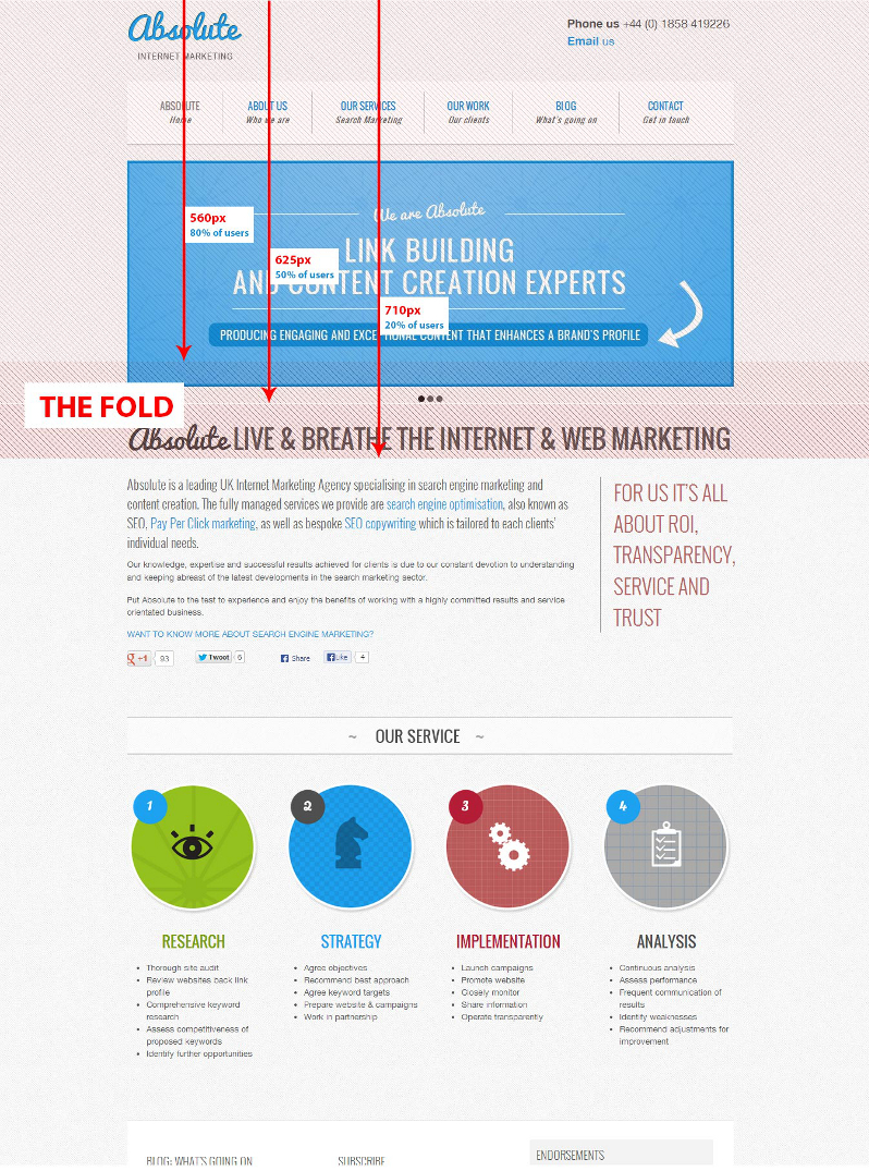
Remember the Pre-Internet Era when people got all of their news from printed newspapers? Even now, competing papers are stacked at newsstands, folded so that just the top halves of their front pages are showing. The day’s biggest headlines and best photos are always placed there, above the fold to entice people to pick up the paper and read it.Today, your business can employ this same technique in laying out your company website to grab visitor’s attention and encourage them to delve deeper into your content.
Where Is the Fold?
This is a fair question in today’s device-diverse media landscape. The modern online fold is almost impossible to pinpoint. Basically, it’s the point at which a site visitor has to start scrolling to see more content. Every device and every browser will display a website differently, so there is no hard and fast rule about where to draw that imaginary line. The best way to determine the location of your site’s fold is to test your website across several different devices and browsers.

What Needs to Be Above the Fold?
Some old-school types cling to the notion that everything of substance needs to be placed above the fold, so visitors to the site will see it all without having to scroll. Most modern web designers reject this, though, since scrolling has now become second-nature to most Internet users, and cramming too much content into too small a space can result in a finished website that’s visually cluttered and difficult to read. A good rule of thumb is to place some of your most eye-catching and appetite-whetting content above the fold, and give site visitors a reason to seek more. A striking image, a concise introductory paragraph and a clear navigation system might be all it takes to capture visitor’s attention and lead them further into your site.
What About Below the Fold?
Even in the newspapers heyday, none of them put all their articles on the top half of the front page and left the rest of the paper blank. Today’s businesses shouldn’t neglect the web space below the fold, either. Rich content is what keeps today’s web surfers returning to their favourite sites. No business can offer that kind of depth without placing content below the fold. Designing your site with graphics that encourage scrolling is one way to be sure that visitors don’t miss important content. Letting compelling text trickle down over the imaginary fold is another.
When laying out your business’s website, you want to make sure that the first impression visitors get is of a clean, useful site. Placing key information and eye-catching graphics at the top of the page is a good way to entice them to explore the rest of your site. Just be sure you don’t get so hung up on working above the fold that white space is eliminated, text and graphics shrink, and the site becomes difficult to navigate.
About the Author
James Patterson is Simple iD’s lead online marketing consultant. Simple iD is a full service online marketing agency that offers clients everything that they need to succeed online, from web design and development to a complete tailor-made online marketing package. Come and check us out on Facebook.


Comments are closed.